vmware background.jpg

VMware Summer Internship

2017 summer, I did my internship with VMware Information Experience Team as a UX designer. I proposed different design approaches to in-product help feature in VMware SaaS products. Now I've grown to be a more mature designer who knows how to embrace ambiguity and speak up for my design.

Individual Project  |  2.5 months  |  Sketch + InVision

First, put myself in users' shoes.

First, put myself in users' shoes.

Define Problem

Define Problem

People don't like to read lengthy documents. So my job is to design a better presentation and interaction style for users to access help content directly inside products without having to visit an external support website.

Why is it important to help users solve issues in products?

1. Users spend lots of time searching externally.
2. They don't necessarily find helpful or correct answers to their problems.
3. A research shows that 72% of users prefer to solve their issues on their own than to contact support service.
4. Users will build trust with VMware more if they receive useful help from VMware.
5. A consistent style of help across products creates a convention for users to easily find help whenever they run into issues using VMware products.

User journey helped me understand the problem deeper.

Users think, feel and do differently when they run into issues, when they are searching for solutions and after their issues get solved. The goal of my design is to convert users' frustration at the beginning to delight at the end.

Broke Down the Problem

Broke Down the Problem

There are two types of persona: Jason, who is an experienced IT staff in his organization, and Mark, who is a new IT member or a non-IT role but needs to use this product. Since their knowledge levels are different, they have different needs regarding amount of help information. In addition, task frequency, content scale and where problems happen need to be taken into consideration.

Design Process

Design Process

Step 1: Comparative Research

I looked into how other cloud services provide their help, including Google Cloud, Cloud Ctrl, Cloudability, Salesforce, etc.

Most services take users out of products to a document center or a support page, except Google Cloud has an in-product help panel and Cloud Cruiser has a pop-up help window.

A big takeaway from this research is that empowering users to see only what they need with a good balance of amount of help information and an simple interface creates a better help-seeking experience.

  Step 2: Break and Combine (Brainstorming)   I broke down design elements in 4 phases: trigger spot, display style, content type and interaction with information. I listed out 5-7 design options in each phase, and then picked one out of each to crea

Step 2: Break and Combine (Brainstorming)

I broke down design elements in 4 phases: trigger spot, display style, content type and interaction with information. I listed out 5-7 design options in each phase, and then picked one out of each to create a new idea.

For example, we can use a button, or a search box, or voice input to trigger the help content which may be displayed in text, or image, or video. This piece of content can be presented in a panel, or a chat window, or a wizard. Finally, users can interact with it by scrolling, or clicking through, or playing in a slideshow.

  Step 3: Narrow Down   I grouped ideas that share common characteristics together and narrowed down to two final ideas: an onion panel and a chatbot.

Step 3: Narrow Down

I grouped ideas that share common characteristics together and narrowed down to two final ideas: an onion panel and a chatbot.

  Step 4: Iterative Design   Along my design process, I always kept other  designers, engineers and technical writers  on the product team involved. In this way, I could make sure the validity and feasibility of my design. I learned a lot from their

Step 4: Iterative Design

Along my design process, I always kept other designers, engineers and technical writers on the product team involved. In this way, I could make sure the validity and feasibility of my design. I learned a lot from their feedback and refined my work to be a more comprehensive solution.

Step 5: Internal Usability Test

I recruited 5 employees who either fit in persona Jason or Mark to test my prototypes. The result pointed out that more information should be put directly on page instead of hiding inside help. Based on this, I proposed a new page to the product design lead and my solution was highly praised!

Onion Panel

Onion Panel

Feel free to play with this idea's inVision prototype.

This Onion Panel is a resizable and scrollable help panel. Users can switch between reading mode and video mode of help materials. Under reading mode, help information is presented in screenshots with highlight and text.

In the final version, I took out steps and put the exact same titles on the pane in order to create a more clear mapping between the main page and the help.

In addition, help content is context-sensitive. Upon the help panel is triggered, the help content is either a page-level help or information related to what users leave blank on a page.

Onion?

Help information is presented in an onion style: one layer at a time. Users will see an overview first and be guided step by step to solve their issues. This creates intimacy between users and the product that they solve problems together throughout the process.

Chatbot

Chatbot

Feel free to play with this idea's inVision prototype.

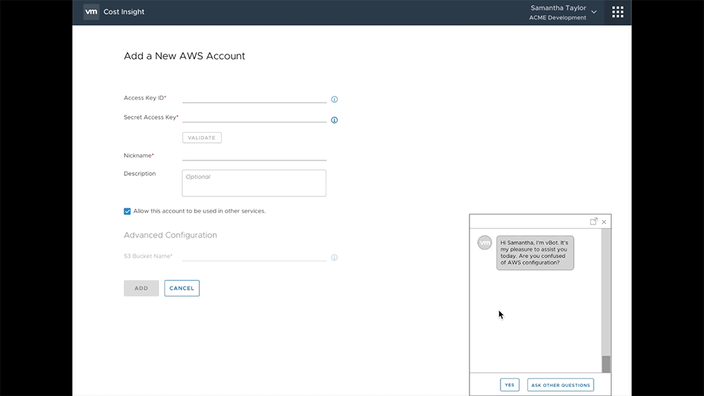
I was looking for the possibility of helping users in a more natural and interactive way. Since VMware's products usually require multiple steps of complex actions, a chatbot can walk users through step by step.

In this idea, default buttons in the reply box can save users time typing. In addition, errors from processing responses in a form of natural language can hopefully be reduced. However, it still allows user to type if they need to.

Most users were not a fan of a chatbot...

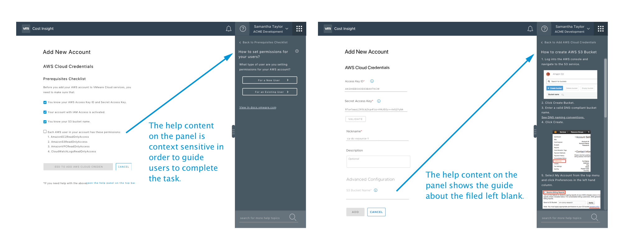
Most of the feedback I got from user testing stated that it was hard to navigate through a chat. Most users preferred the help panel over a chatbot because they had more control on the panel.

In addition, they expected to talk to a real person once they saw a chat window.

Therefore, I focused on refining the design of the help panel during the last month of my internship. But I still kept the conversation rolling about improving a chatbot experience in my user testing.

I learned. I grew.

I learned. I grew.

I've learned how to embrace ambiguity at the beginning and take advantage of being a fresh eye on a problem. Now I'm more comfortable with swimming in an unknown universe of a problem and opening a clear path out to the shining sun.

I'm also better at collecting helpful feedback and cross-team collaboration. Every role is equally important on a product team. A seamless collaboration is even more critical to a successful product.

After this internship, I can't be more sure about my passion of becoming an influential UX designer.